FLYY Sports — Conversion-Focused Website Redesign
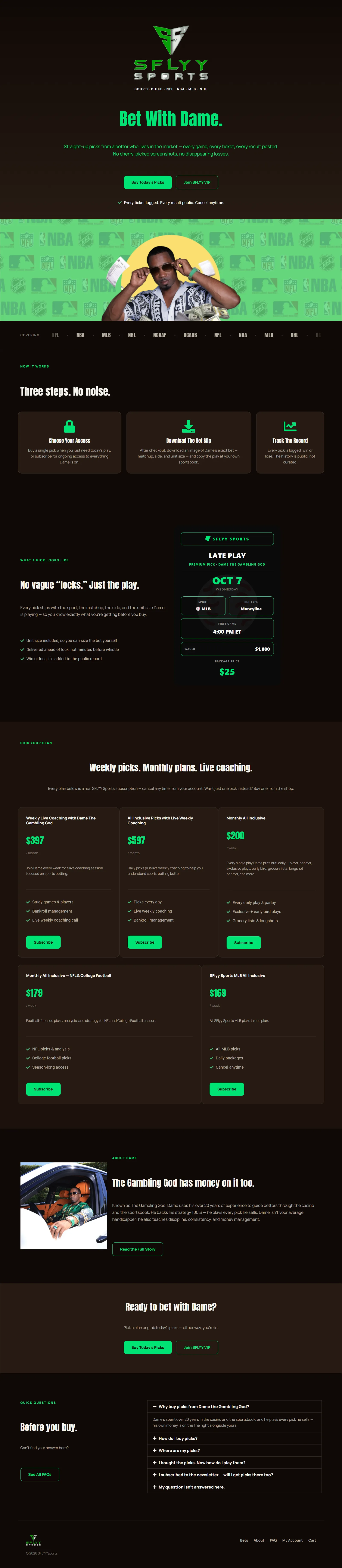
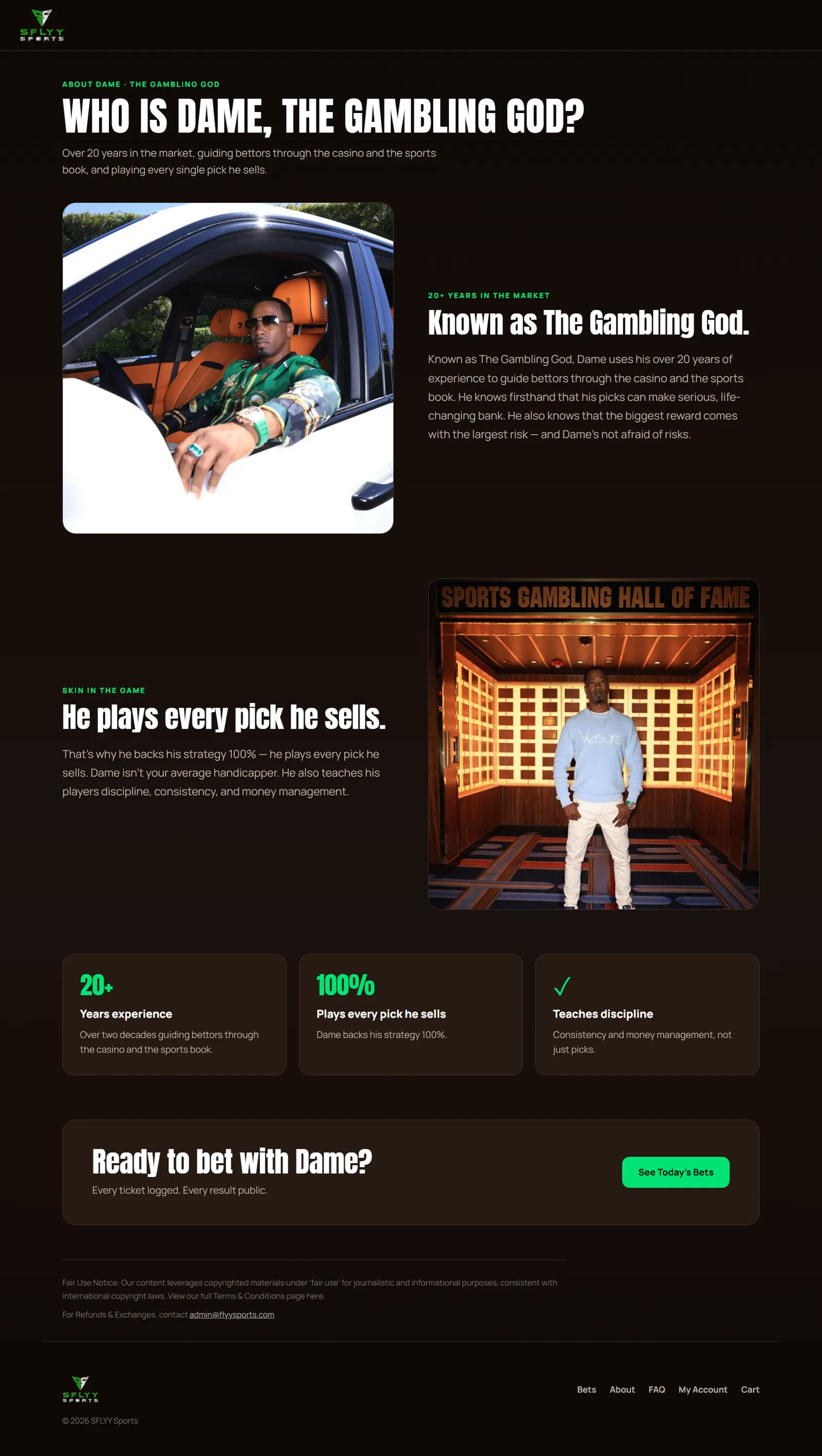
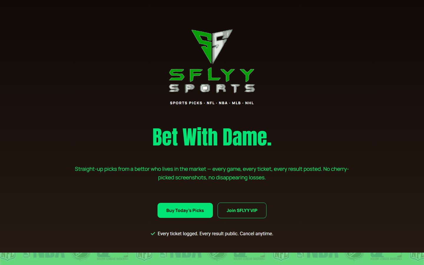
Redesigned the FLYY Sports website into a streamlined, conversion-focused sales funnel designed to guide visitors from the homepage through product discovery and ultimately to checkout.
The challenge
The previous website design did not provide a clear and intentional customer journey. Visitors could browse the available sports packages and offers, but the overall experience lacked a strong funnel structure. Important products and calls-to-action were not presented in a way that naturally guided users toward purchasing. Key challenges included: An outdated visual experience Less focused navigation No clearly defined conversion path Too many opportunities for users to leave the purchasing journey Product discovery and purchasing were not connected through a streamlined flow
The approach
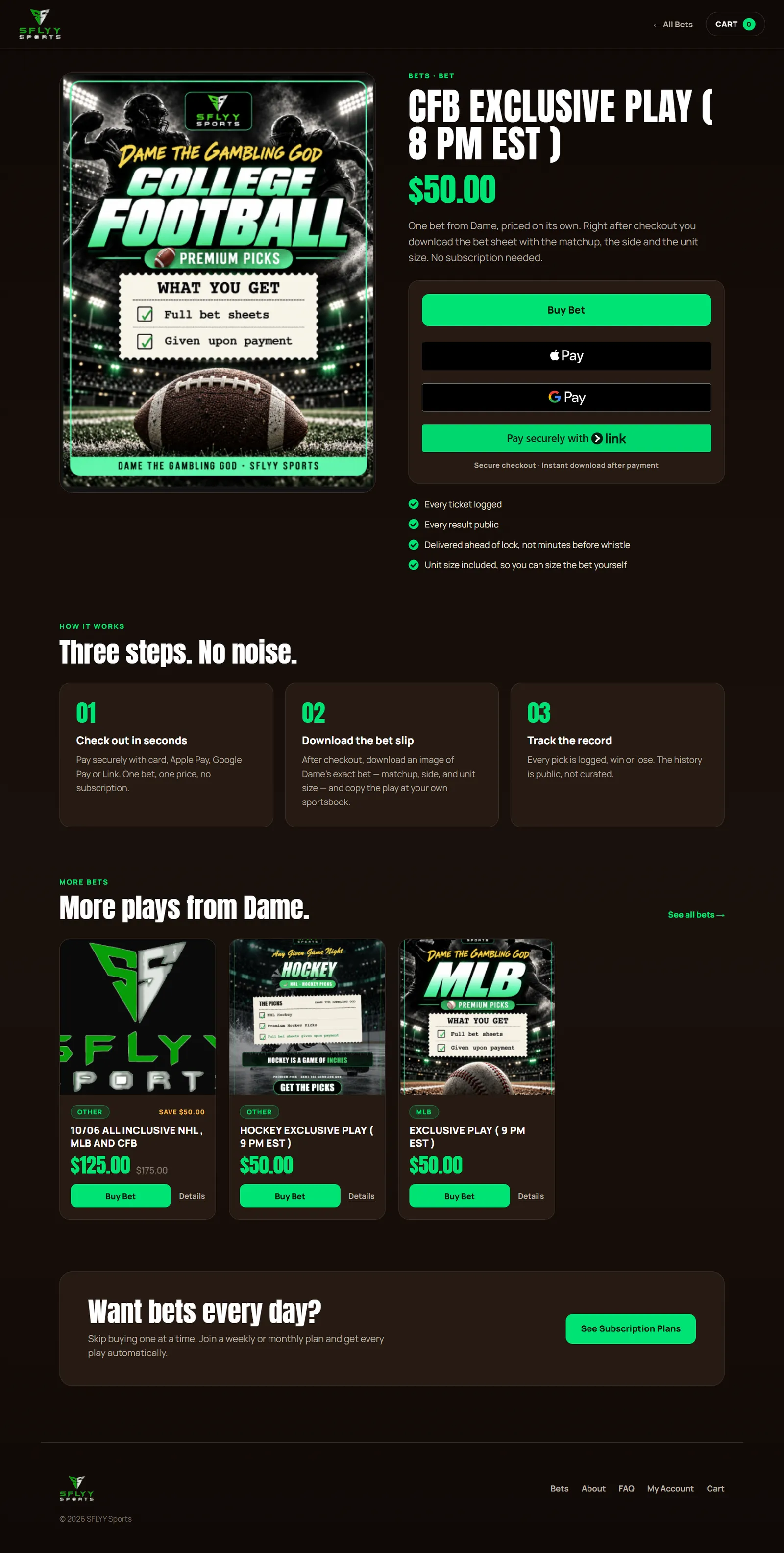
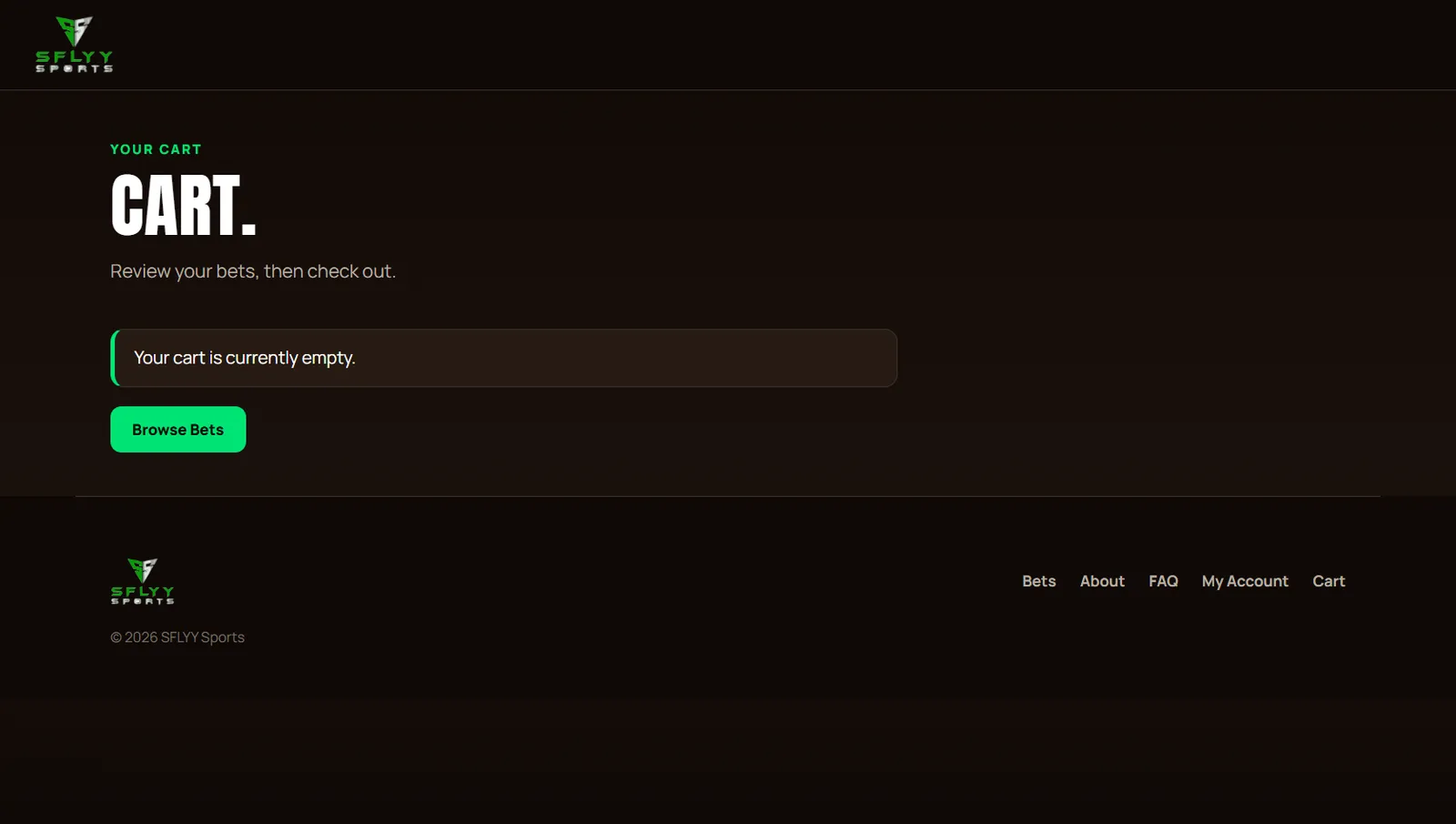
I redesigned the website around a funnel-based user experience. Instead of treating the website as a collection of separate pages, I structured it as a guided customer journey: 1. Home Introduce the brand, communicate the main value proposition, and direct users toward the available offers. 2. Products Present the available products and packages in a clear, organized way so visitors can quickly identify what they are interested in. 3. Product Selection Give users the relevant product information and a clear call-to-action to continue. 4. Checkout Create a focused purchasing experience that minimizes unnecessary steps between product selection and completing the purchase. The redesign focused on improving visual hierarchy, CTA placement, product presentation, and overall user flow.
The process
1. Website & UX Review Reviewed the existing website structure and identified areas where the customer journey could be simplified. 2. Funnel Planning Mapped the ideal visitor journey from the initial landing experience through product discovery and checkout. 3. Information Architecture Restructured the website around the primary conversion path: Home → Products → Checkout 4. UI/UX Redesign Created a cleaner and more modern interface with stronger visual hierarchy, clearer sections, and more prominent calls-to-action. 5. Product Experience Improved the way products and packages are presented so visitors can understand the available offers more quickly. 6. Conversion Flow Reduced unnecessary navigation and designed the pages to continuously guide users toward the next step. 7. Testing & Refinement Reviewed the complete journey from landing on the website to reaching checkout and refined the experience to make the flow more intuitive.
The outcome
The redesign transformed the website from a traditional browsing experience into a more structured conversion funnel . Key improvements included: Clearer customer journey More focused product discovery Stronger calls-to-action Simplified navigation More intentional page structure Direct path from homepage to products to checkout More modern and professional visual presentation Better alignment between the website design and the goal of generating purchases Primary outcome: A website experience designed around moving visitors toward a specific action rather than simply providing information.
What’s inside
- Clearer customer journey
- More focused product discovery
- Stronger calls-to-action
- Simplified navigation
- More intentional page structure
- Direct path from homepage to products to checkout
- More modern and professional visual presentation
- Better alignment between the website design and the goal of generating purchases
A closer look